Here is a great review of PCLinuxOS from the site distro-review . The original article can be found here.
Just take a look at the screenshots, isn’t it beautiful? Wish Ubuntu looked that nice! While Ubuntu may be the top distro, PCLinuxOS seems to be catching on. For the last 3 years Ubuntu topped the charts on http://distrowatch.com/ (Linux enthusiasts look up to this site for comparison among various distros), however PCLinuxOS had taken the top spot from Ubuntu for few months running. Currently OpenSUSE is currently leading and Ubuntu is on second spot.
PCLinuxOS Gnome 2.21.2
Submitted by seopher on Thu, 03/06/2008 - 10:31.
I have a lot of confidence in the PCLinuxOS guys (Texstar) because PCLinuxOS 2007 was (and still is) one of my favorite releases ever. I was worried for a while that nothing was going on in the PCLOS camp because there was no word of PCLOS2008. However what they were working on was PCLinuxOS Gnome 2.21.2 and I've finally got around to reviewing it.
PClinuxOS 2007 was possibly the best release of last year, so will this Gnome edition give Ubuntu some pressure?
Aesthetics and Live CD
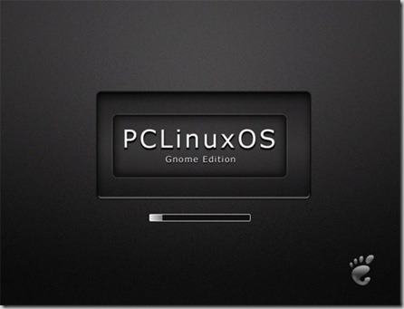
PCLinuxOS was one of the most visually pleasing releases I've toyed with so I was somewhat surprised when I saw the LiveCD loading. It wasn't that attractive (in my personal opinion) and couldn't hold a flame to PCLOS2007, so what was going on?
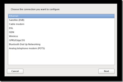
PCLOS then began to toy with me by asking me which device I wanted to configure with a stylish prompt; a gentle gradient on the selected item topped off a sexy looking menu... So maybe the first screen I saw was overlooked somehow? Here's the menu:
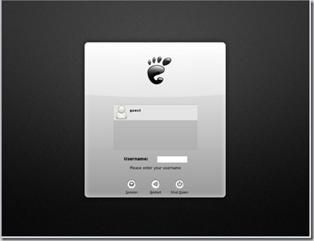
But then once I'd configured my network device (which was unbelievably easy I might add) I was then prompted with another rather ugly screen prompting me to login:
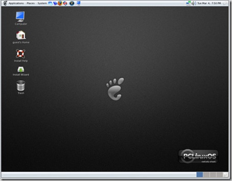
I don't get it, PCLinuxOS 2007 had consistently excellent designs throughout, maybe the designers had gone on strike? However once you login and you're in the Gnome environment everything looks sexy again; subtle gradients, strikingly excellent icon designs and a clean, uncluttered (typically Gnome) environment. I don't get the whole journey but I really like it once you're logged in - and ultimately that's what counts. Maybe it's personal preference but the loading screens don't do it for me, but once you're in the system it's sexy. Very sexy.
Installation
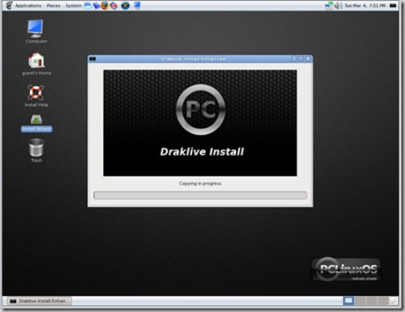
Much like the KDE PCLOS, this Gnome edition uses the Draklive installer that comes with Mandriva and while some users don't like it I personally love it. I think it's the most intuitive installer around at the moment and that's excellent for new users who don't understand partitioning (etc). As always the installation goes smoothly with Draklive handling all my partioning for me with minimal intervention required. Anyone could install PCLOS.
Environment and Applications
PCLOS Gnome edition was released on December 28th 2007 and as such ships with Kernel 2.6.22.15, Gnome 2.21.2 and a bundle of default installed apps (Firefox, Azureus, XMMS, you get the idea). Listing the applications is folly when Synaptic is installed; just go shopping and download whatever you want. As my girlfriend put it "what, so it's like shopping online where everything is free?" It's worth noting though that a lot is on offer directly post-install for those who want instant "plug and play" functionality.
Networking
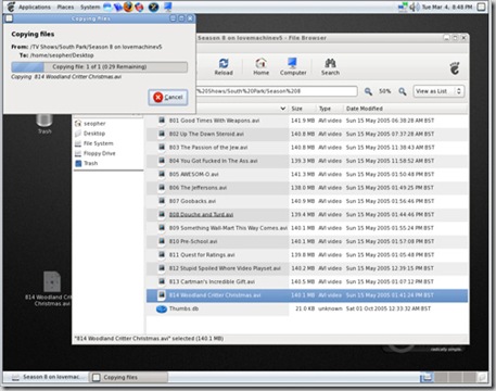
PCLOS picked up my network without issue (although I can't comment on wireless drivers because I'm using a wired connection). Once connected it picked up my windows network effortlessly and allowed me to access all my files in the Samba shares. Now that I'm on my network it's time to drag some media files over and see what the codec support is like. However, sorry about dragging on about aesthetics but how sexy is the below screenshot of me simply copying a file...
Media Playback
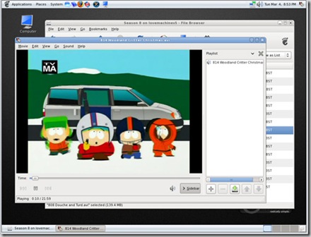
The selection of media files I tried playing all worked fine without requiring me to source some codecs so I can only assume PCLOS comes with popular ones preloaded. This is good because "normal" users want "plug-and-play" functionality, they don't want to have to faff around finding codecs and apt-getting packages. Media support in this release is excellent so that's good.
Configuration
The PCLinuxOS control centre (that is used on both this Gnome version and the KDE 2007 one) is excellent. It's intuitive and powerful in equal measures. I like the wording used on the options "change the screen resolution" for example; these are terms that normal users will be comfortable with. "Display Settings" seems so cold and ambiguous so that's why I consider this configuration utility to be high on the usability scale.
Conclusion and Overall Thoughts
It's very polished, fast and thoroughly beautiful once you've gone past the confusingly ugly loading screens. It's very usable and while I (through personal preference) don't find Gnome environments as intuitive as KDE it still works together very well. Out of the box functionality is impressive and that's a desirable thing in modern linux distros. It's the overall feel that impresses me; the menus slide gently, the subtle gradients and excellent icon design give the feeling that a lot of thought went into the user experience.
Yet that just confuses me even more as to why the loading visuals (and even the default wallpaper) are a little less than sexy. Ho hum. Go try this release, it's worth a look as an Ubuntu alternative.
Other Links:
http://en.wikipedia.org/wiki/PCLinuxOS
http://www.linux.com/articles/62199
http://reallylinux.com/docs/pclinuxosintro.shtml
If there is any one distro apart from Ubuntu I would like to try it has to be PCLinuxOS.
